Selecting the perfect color palette for silk flower sets can significantly impact aesthetics and ambiance. Proper color choices enhance mood and evoke emotions in various settings. According to a report by the Color Marketing Group, 93% of consumers prioritize color when making purchasing decisions. This highlights the importance of understanding how to choose the right color palette for silk flower sets.
When considering your options, think about the environment where the flowers will be displayed. Light and dark shades can alter perceptions of space. Neutral tones offer versatility, while bold colors can create focal points. Studies show that color combinations can also influence perceived value. Silk flowers representing seasonal themes or events prompt additional considerations. Don't overlook the balance between personal preferences and industry trends.
Color psychology plays a crucial role in design. For instance, warm colors can stimulate energy, while cool tones promote calmness. An American study revealed that certain color palettes could increase consumer engagement by up to 25%. It's essential to reflect on the desired emotions and the audience's response. Remember that imperfections in color choices can lead to innovative approaches, fostering creativity and personal expression.
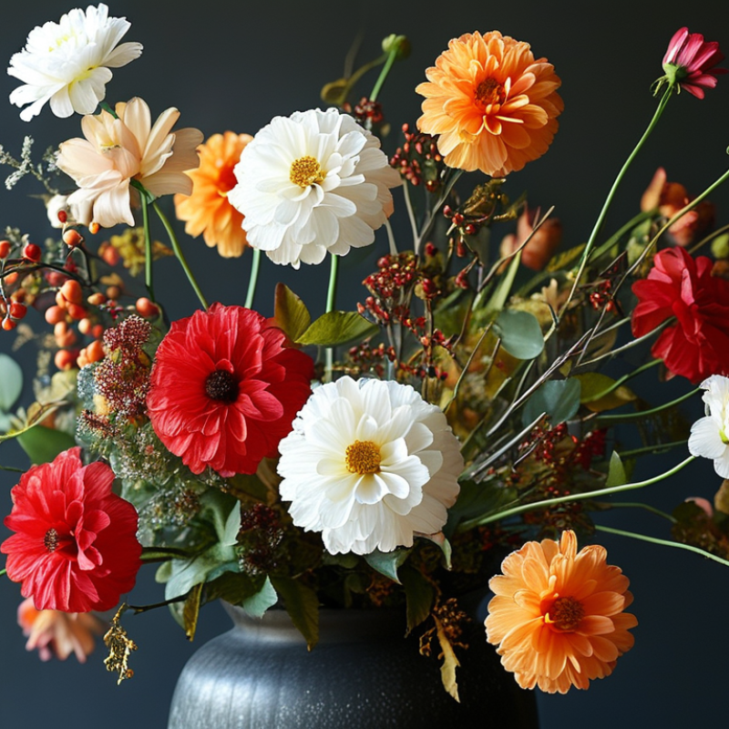
Color theory plays a crucial role in creating beautiful silk flower arrangements. Understanding the basics can enhance your design skills. At its core, color theory involves the color wheel and the relationships between colors. Complementary colors, for instance, are opposite each other on the wheel and create a dynamic contrast. This can add vibrancy to your silk flower sets.
Using analogous colors, which sit next to each other on the wheel, allows for a harmonious look. These colors blend seamlessly and evoke a calming effect. Consider a mix of soft greens and blues for a tranquil arrangement. However, even when using complementary or analogous schemes, be cautious. The balance between colors is key. Too many shades can lead to visual chaos.
Experimenting with saturation and brightness adds depth to your designs. Bright, bold colors can draw attention, while muted tones bring subtlety. But be aware of the emotions each color invokes. Red sparks passion, while blue suggests serenity. Understanding these nuances can guide your choices. Reflect on the overall mood you wish to create in your arrangements.
When selecting a color palette for silk flower sets, the space and setting play a crucial role. Consider the existing decor. A bright, airy room can be complemented with pastel tones. These softer hues add elegance without overpowering. In contrast, a darker space may benefit from richer colors, like deep reds or purples. These tones can create a striking focal point.
Examine the purpose of the room. A lively and energetic setting, like a kitchen or playroom, can handle vibrant colors. Think yellows or oranges to inspire warmth and creativity. For a calming atmosphere, such as a bedroom, opt for muted shades. Blues or greens can promote tranquility.
Lighting also affects how colors are perceived. Natural light enhances saturation, while artificial lighting can soften tones. Test small samples before committing. This allows you to see how colors interact with your environment. Remember that personal preference matters. Don’t hesitate to experiment with unexpected combinations. Finding the perfect palette is often a journey of discovery.
Choosing the right color palette for silk flower sets involves understanding complementary colors to create visual harmony. A recent report from the Color Marketing Group indicates that colors evoke emotions and can influence consumer choices significantly. In floral design, using complementary colors can enhance appeal and impact. For instance, pairing warm tones like oranges and reds with cool tones such as blues and greens can create stunning contrasts.
Careful consideration of shades is crucial. Slight variations in tones can alter the overall perception of your arrangement. A study by Pantone demonstrates that certain color combinations are more appealing. Pastel colors tend to evoke feelings of calmness, while vibrant shades stimulate energy. However, not every combination works flawlessly. Sometimes, unexpected contrasts can fall flat or clash. Testing different orientations can help determine the best balance.
Be mindful when mixing colors. Overly complex palettes can confuse the viewer. Simplicity often leads to greater visual impact. It's beneficial to experiment with fewer colors for a more cohesive look. Regular observation and reflection on your choices can lead to better design outcomes. Ultimately, finding the right harmony in colors often requires patience and repeated attempts to achieve the intended beauty.
| Color Combination | Visual Effect | Recommended Occasion |
|---|---|---|
| Soft Pink & Cream | Gentle and Romantic | Weddings, Anniversaries |
| Purple & Gold | Luxurious and Dramatic | Gala Events, Formal Parties |
| Blue & White | Fresh and Clean | Spring Parties, Corporate Events |
| Coral & Teal | Vibrant and Energetic | Summer Celebrations, Beach Parties |
| Yellow & Gray | Modern and Bright | Contemporary Gatherings, Art Exhibitions |
Choosing the right color palette for silk flower sets can be challenging. Seasonal trends significantly influence what colors resonate with customers. For instance, spring often brings soft pastels like blush pink and light lavender. In contrast, vibrant autumn shades like deep red and burnt orange have their unique appeal. This contrast highlights the importance of aligning colors with seasonal moods.
When considering trends, pay attention to popular colors showcased in fashion and home decor. Colors like earthy greens and warm neutrals are gaining traction. However, it's essential to mix and match thoughtfully. A limited palette may seem safe but can also appear uninspired. Experimenting with unexpected combinations can create a fresh perspective. Reflecting on past choices can reveal what worked and what didn’t.
Avoid sticking too rigidly to trends. Sometimes, what’s popular may not resonate with your target audience. Take time to analyze customer feedback on previous collections. Understanding preferences can guide your palette choices more effectively. Each season brings an opportunity to renew and refresh your designs. Embrace the challenge of finding balance between trendiness and your unique style.
Choosing the right color palette for silk flower sets is crucial. It greatly influences mood, aesthetics, and market appeal. Testing color combinations can help you finalize the best choices. A 2022 report by the Color Marketing Group indicated that color plays a significant role in consumer choices. Over 80% of people base their purchasing decisions on color alone.
Before settling on a color palette, consider creating sample arrangements. This allows for a tangible representation of your vision. Different lighting conditions can alter how colors appear. A study from the International Floral Trade Association revealed that colors look different under natural and artificial light. Testing combinations in various settings ensures that your palette performs well in real-world scenarios.
Evaluating color combinations can reveal unexpected outcomes. Some pairings may look great on paper but fail in practice. Reflecting on these results helps refine your choices. Engaging with customer feedback can also provide insight. Understanding what resonates with your audience is essential for success. Testing, reflecting, and adjusting are key to achieving the ideal silk flower set.
: Color theory involves the color wheel and color relationships. It’s essential for designing beautiful silk flower arrangements.
Complementary colors are opposite each other on the color wheel. They create dynamic contrast and vibrancy in arrangements.
Analogous colors are next to each other on the wheel. They blend seamlessly and evoke a calming effect in designs.
Balance is key when mixing colors. Too many shades can create visual chaos. Keep your palette simple for greater impact.
Saturation and brightness add depth to designs. Bold colors can attract attention, while muted tones offer subtlety.
Colors evoke emotions and influence choices. For example, red suggests passion while blue indicates serenity. Reflect on this in your designs.
Unexpected contrasts may not always work. Sometimes, they fall flat. It's wise to test different combinations to find harmony.
Experiment with fewer colors for cohesion. Often, simplicity leads to a more impactful arrangement. Reflect on your choices regularly.
Yes, reflection is part of the process. Not every combination works perfectly, and learning from mistakes can enhance your skills.
Choosing the right color palette for silk flower sets is an essential aspect of creating visually appealing arrangements. To begin, it’s important to understand color theory, which helps in selecting colors that complement each other and enhance the overall aesthetic of the space. Identifying the setting where the flowers will be displayed will further guide your choices, ensuring they harmonize with existing decor.
In addition to foundational color principles, incorporating seasonal trends can bring a fresh, contemporary feel to your arrangements. Experimenting with various color combinations is crucial; testing these combinations in the intended setting allows you to visualize the final look before making a commitment. By following these guidelines on how to choose the right color palette for silk flower sets, you can create stunning arrangements that perfectly suit your environment.
Maison Flower